Fiona: The Artist
Primary goal: Create and sell sustainable work without increasing time spent sourcing or self-promoting.
TOOLS:
TOOLS:
FIGMA, CLAUDE, GOOGLE FORMS
FIGMA, CLAUDE, GOOGLE FORMS
ROLE:
ROLE:
BRANDING, DESIGN SYSTEM, APP UX, UX RESEARCH
BRANDING, DESIGN SYSTEM, APP UX, UX RESEARCH
TEAM:
TEAM:
EMMA JENKINS, ELISSA DOW, & SHRIN ROYMOULIK
EMMA JENKINS, ELISSA DOW, & SHRIN ROYMOULIK
EcoArtisan is a platform designed to support Canadian artists by making sustainable materials more accessible, increasing exposure, and strengthening community connections across artists, buyers, and suppliers.
EcoArtisan is a platform designed to support Canadian artists by making sustainable materials more accessible, increasing exposure, and strengthening community connections across artists, buyers, and suppliers.
This gap presented an opportunity to design a single platform that simplifies sustainable material sourcing, increases artist visibility, and enables trust-based collaboration between artists, buyers, and suppliers. Success was defined as users being able to discover, list, and connect across the platform, no matter their needs, with minimal friction.
How might we create a trusted, low-friction platform that allows artists, buyers, and suppliers to fluidly switch roles while supporting sustainable creation?

Using a mixed-methods approach, research focused on identifying barriers to sustainable creation, understanding user needs across the ecosystem, and assessing market viability.
9 semi-structured interviews
16 survey responses
Competitor analysis
Secondary market research
Using a mixed-methods approach, research focused on identifying barriers to sustainable creation, understanding user needs across the ecosystem, and assessing market viability.
9 semi-structured interviews
16 survey responses
Competitor analysis
Secondary market research
Using a mixed-methods approach, research focused on identifying barriers to sustainable creation, understanding user needs across the ecosystem, and assessing market viability.
9 semi-structured interviews
16 survey responses
Competitor analysis
Secondary market research
My team and I designed three interconnected personas to reflect our ecosystem.
My team and I designed three interconnected personas to reflect our ecosystem.

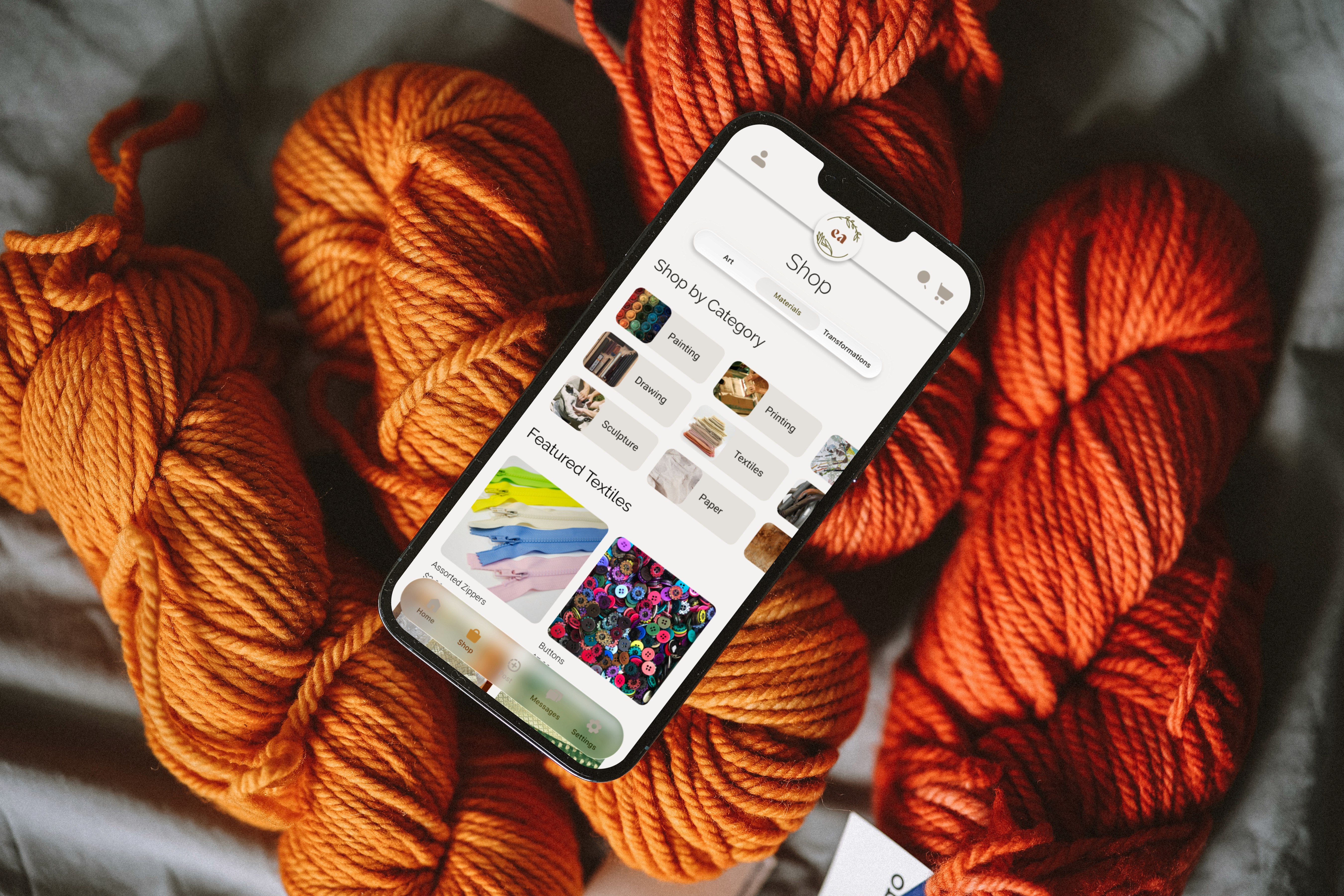
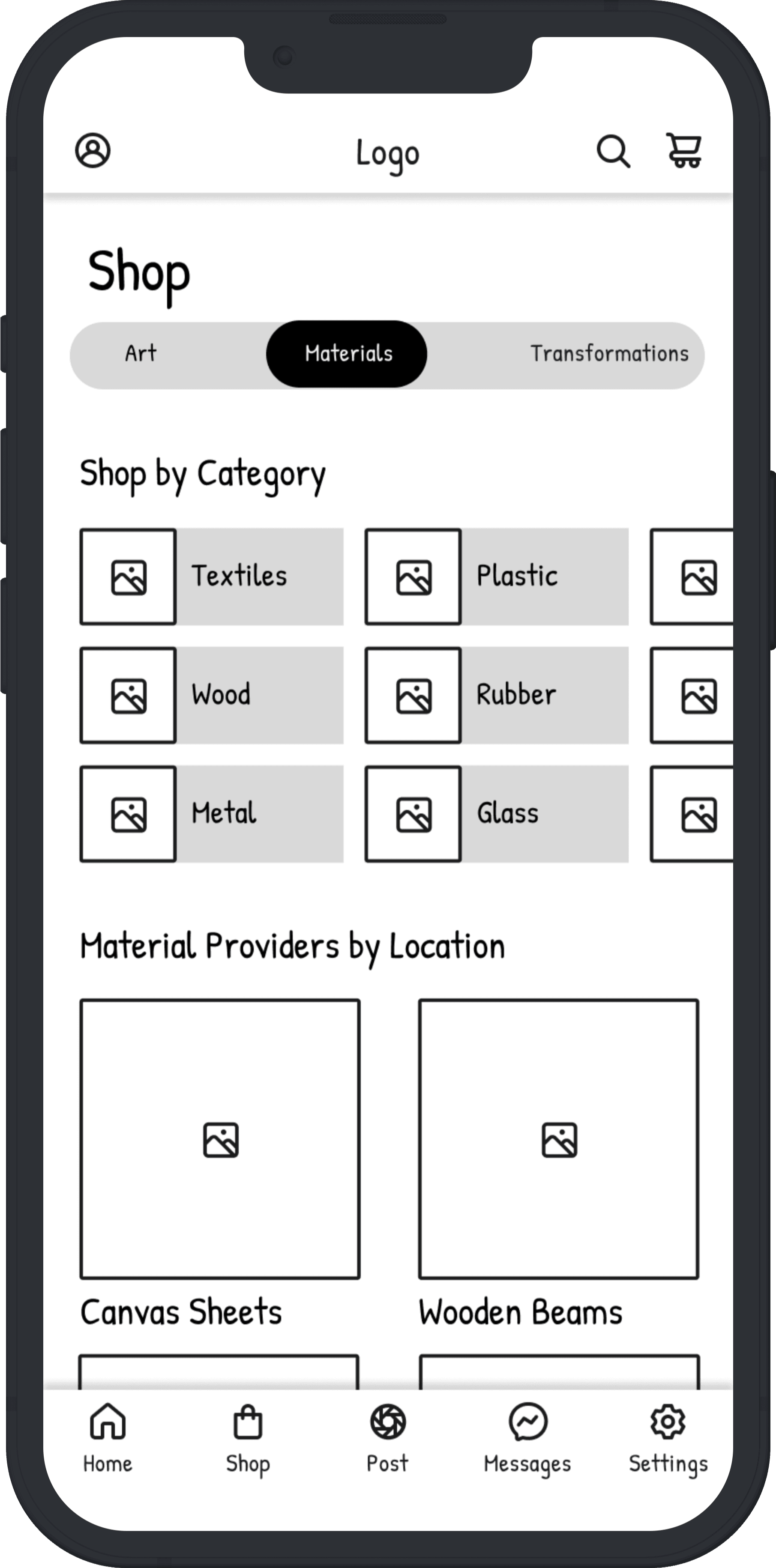
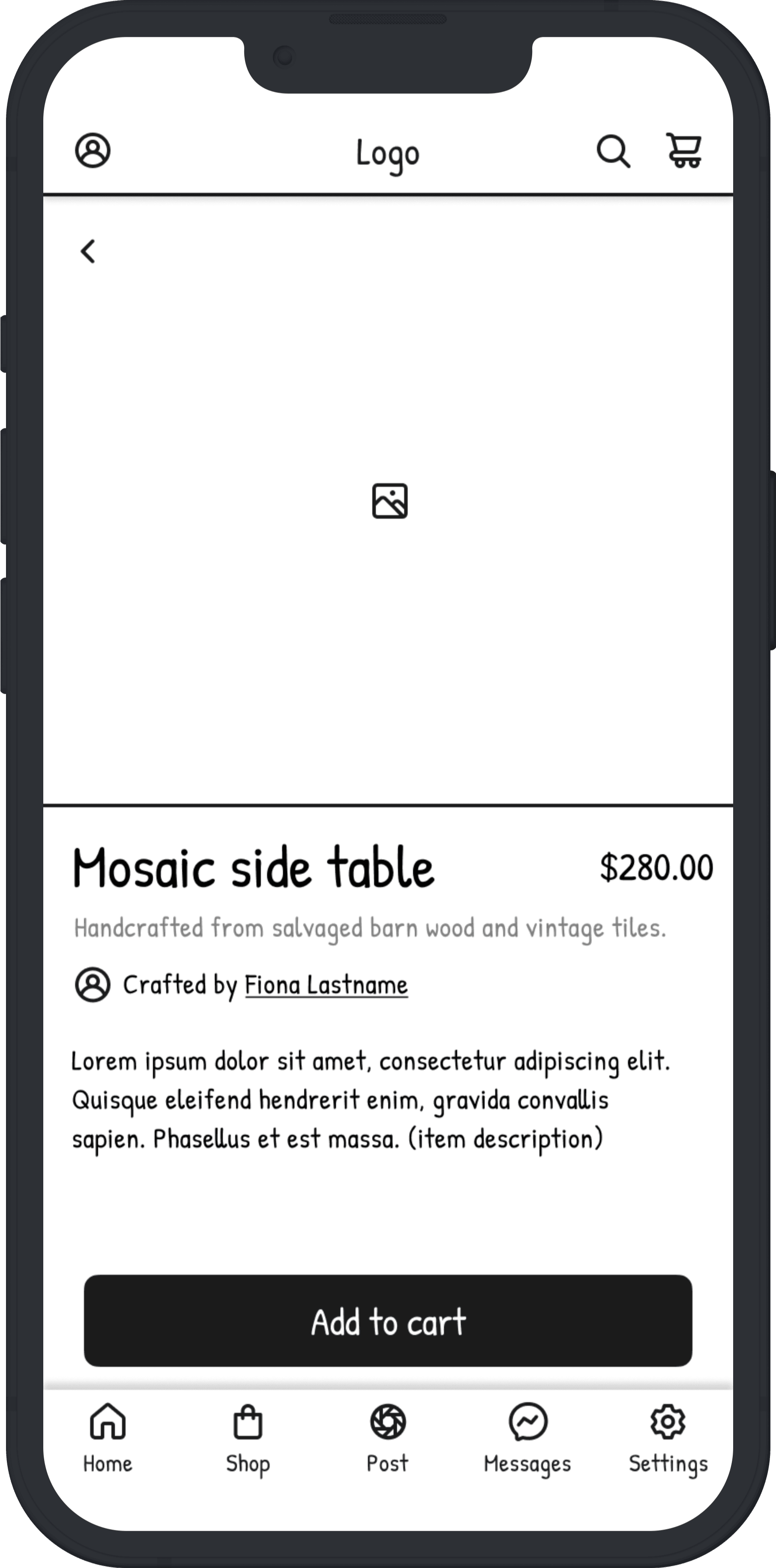
Early exploration considered separate interfaces for artists and buyers. This approach was rejected due to increased complexity and onboarding friction. A unified interface was chosen to support fluid role-switching and reduce cognitive load. All users can browse, post, and sell from the same space.
Early exploration considered separate interfaces for artists and buyers. This approach was rejected due to increased complexity and onboarding friction. A unified interface was chosen to support fluid role-switching and reduce cognitive load. All users can browse, post, and sell from the same space.
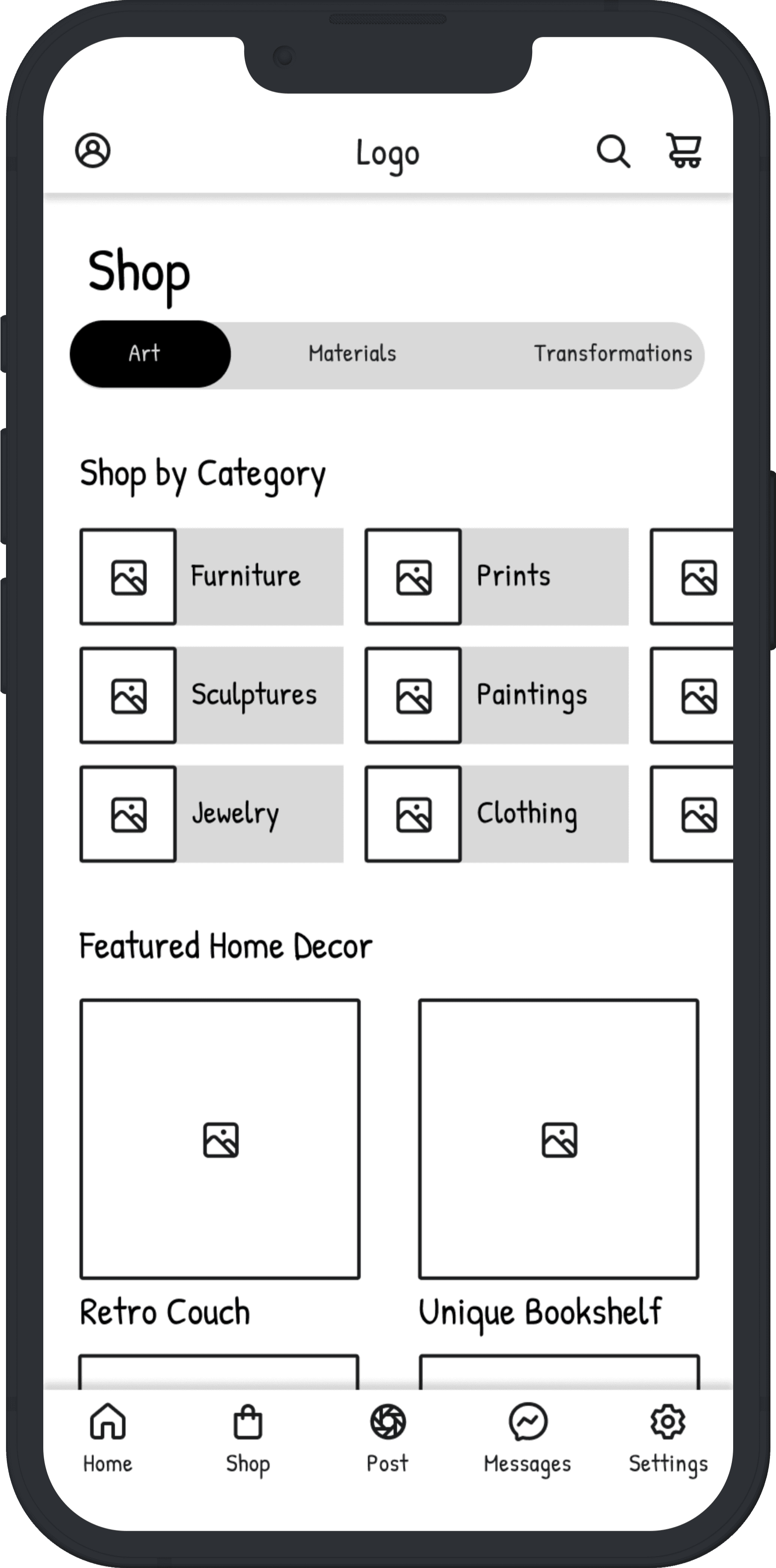

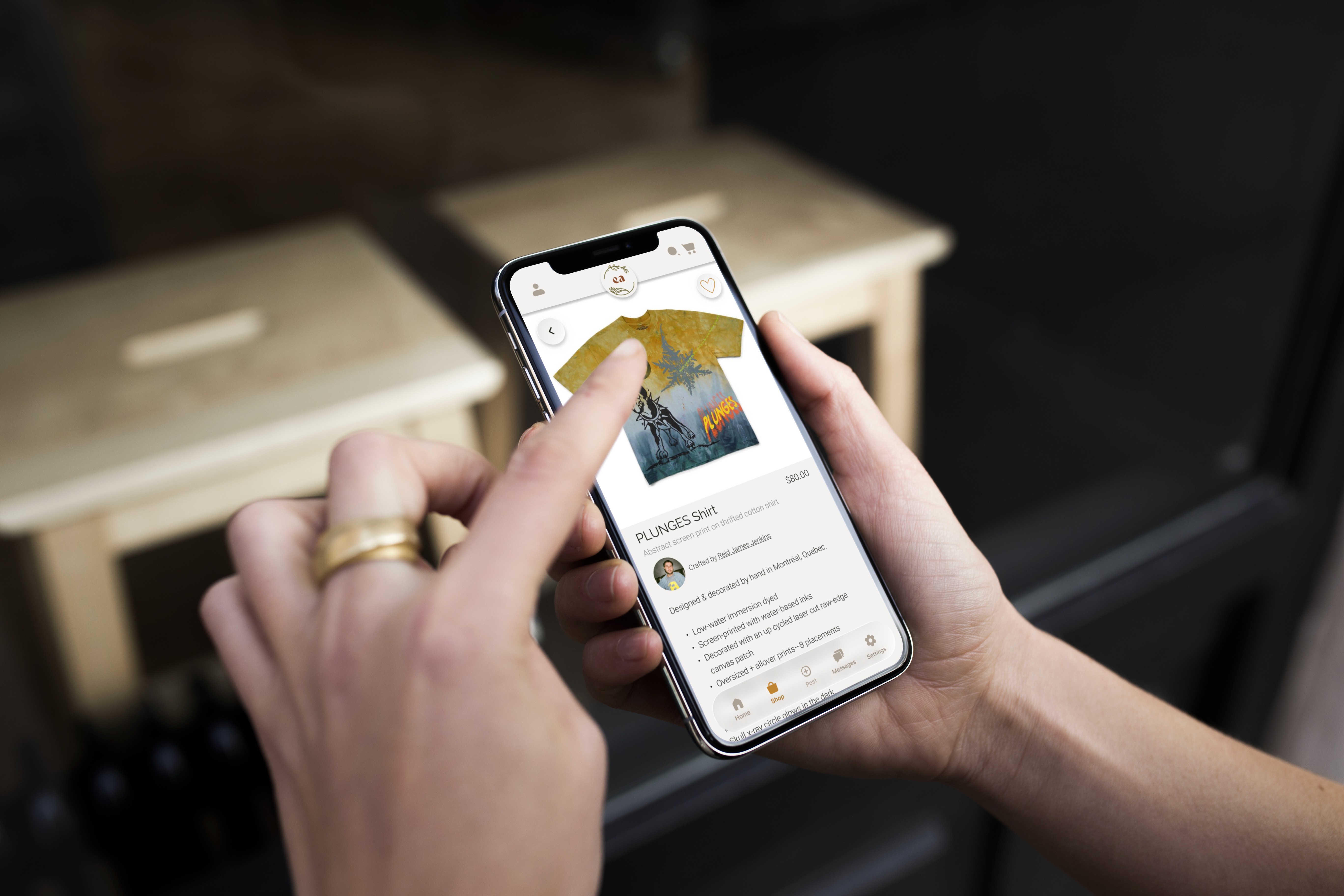
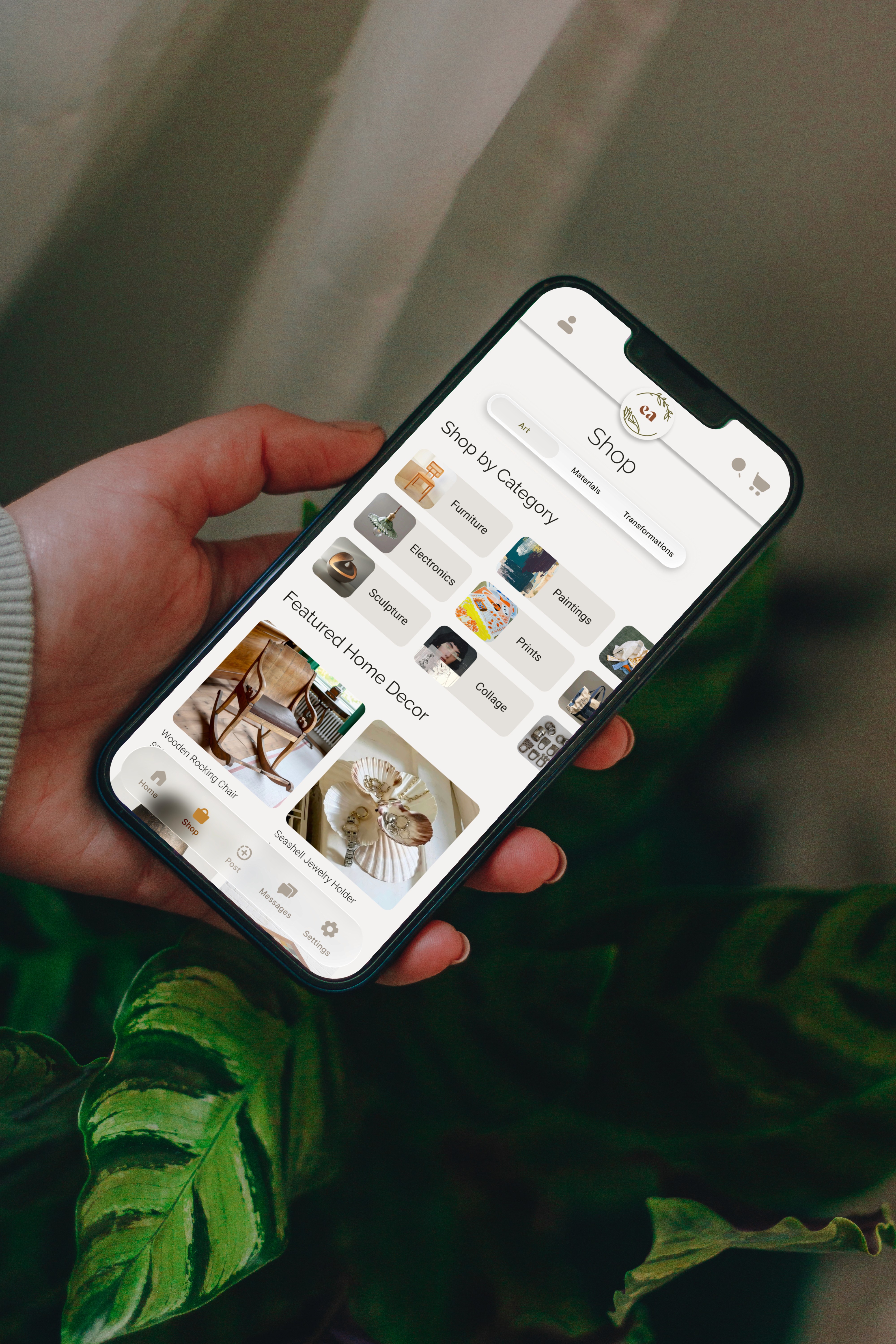
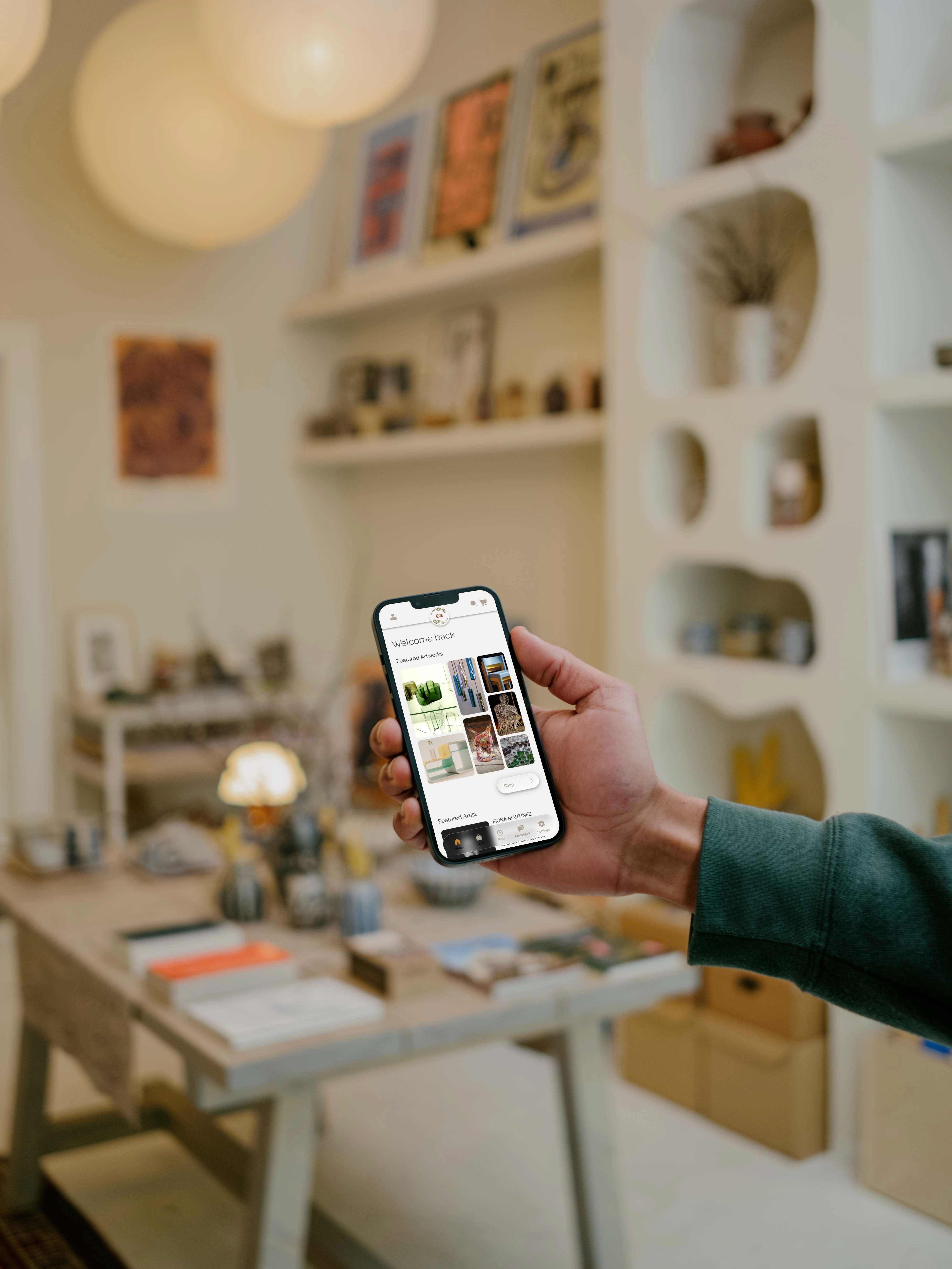
A significant part of my role focused on leading the visual identity and establishing the design system. For a platform centered on art, restraint became a guiding principle. Like an art gallery, the interface needed to act as a backdrop; clean, minimal, and non-distracting which would allow the artists’ work to remain the focal point.
A natural palette of green and terracotta was introduced to evoke sustainability, while neutral tones receded into the background to reduce visual competition with users’ content. This balance ensured the platform felt environmentally grounded without overwhelming the artwork being showcased.
In developing the logo, I explored themes of circularity and natural form, reflecting both sustainability principles and the cyclical exchange of materials within the platform. Organic shapes and subtle references to the artist’s hand reinforced the human, maker-centred nature of the platform. I presented multiple logo explorations to the team and ultimately synthesized elements from several concepts to create the final logo.


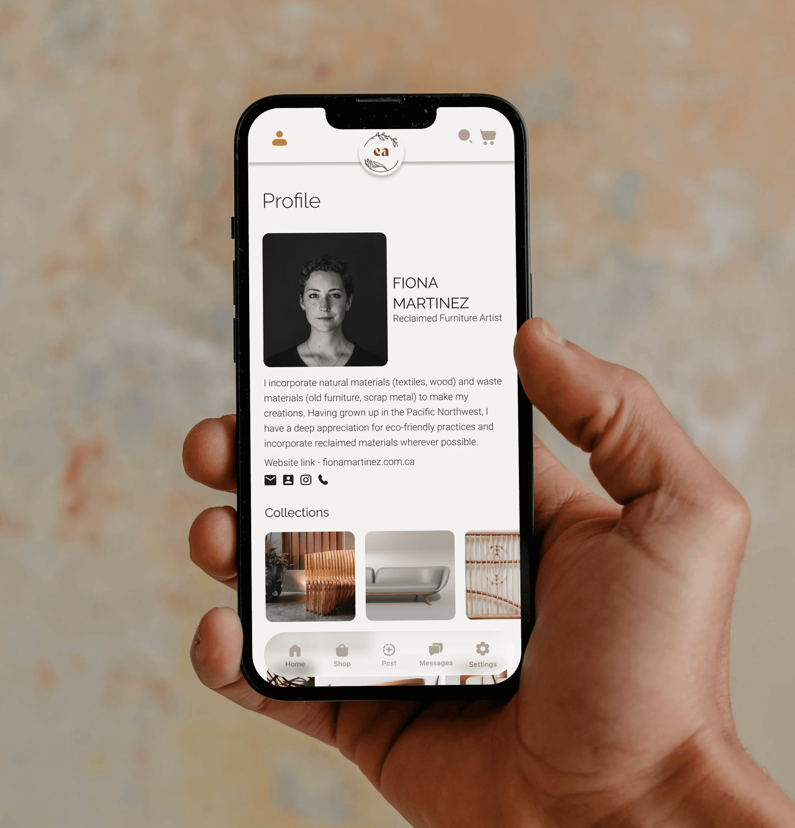
The product experience was designed to reduce friction across roles while maintaining clarity and trust throughout the ecosystem; since many users may operate in multiple capacities. Flexibility and simplicity were prioritized over rigid role separation.
Key decisions informed by research included:
Unified marketplace toggle:
A single interface allows users to switch between Art, Materials, and Jobs without navigating separate environments, reducing onboarding friction and cognitive load.
Verified profiles and community reviews:
Transparency mechanisms address concerns around sustainability claims and material quality, strengthening trust across all user groups.
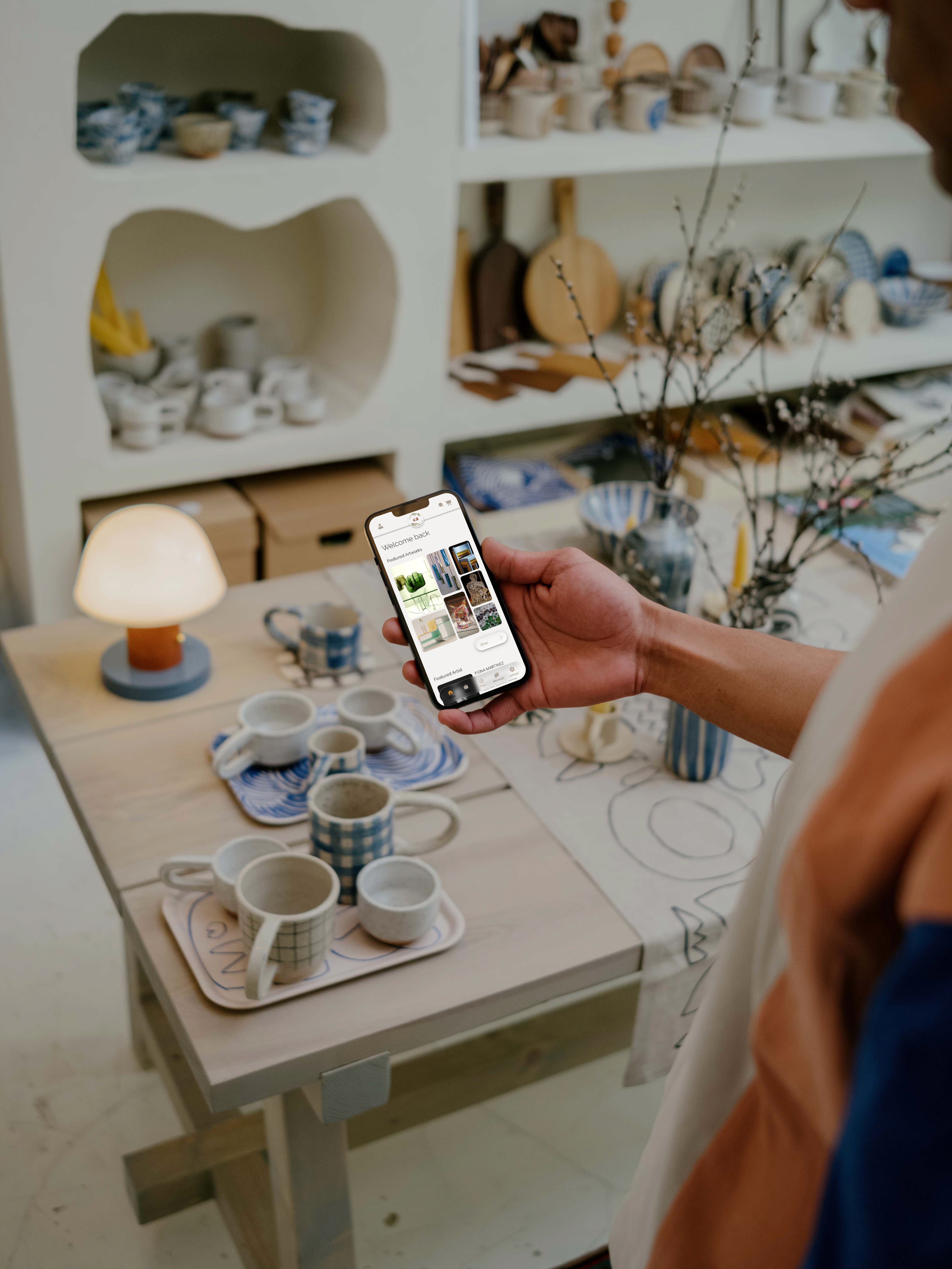
Integrated messaging and featured artist sections:
Direct communication and curated visibility support collaboration while reducing the need for external self-promotion.
Together, these decisions created a flexible ecosystem that supports sustainable creation without adding complexity to the user experience.
The product experience was designed to reduce friction across roles while maintaining clarity and trust throughout the ecosystem; since many users may operate in multiple capacities. Flexibility and simplicity were prioritized over rigid role separation.
Key decisions informed by research included:
Unified marketplace toggle:
A single interface allows users to switch between Art, Materials, and Jobs without navigating separate environments, reducing onboarding friction and cognitive load.
Verified profiles and community reviews:
Transparency mechanisms address concerns around sustainability claims and material quality, strengthening trust across all user groups.
Integrated messaging and featured artist sections:
Direct communication and curated visibility support collaboration while reducing the need for external self-promotion.
Together, these decisions created a flexible ecosystem that supports sustainable creation without adding complexity to the user experience.
Through multiple rounds of usability testing, we evaluated the clarity, flow, and overall usability of the EcoArtisan platform. Testers responded positively to the clean, trustworthy interface. Feedback also revealed areas for refinement; particularly around low-contrast elements on darker images, word-heavy menu options, and moments where the visual hierarchy needed clearer structure.
Overall, testing confirmed that users perceived the platform as intuitive, reliable, and visually appealing, with most completing key tasks with minimal friction. With more time, I would further test role-switching behaviours and refine accessibility across varied image backgrounds to ensure consistent readability.