TIMELINE:

17 WEEKS

ROLE:

UX RESEARCHER, UI DESIGNER

CONTRIBUTORS:

EMMA JENKINS, ELISSA DOW, SHRIN ROYMOULIK

Cover

Eco Artisan

overview.

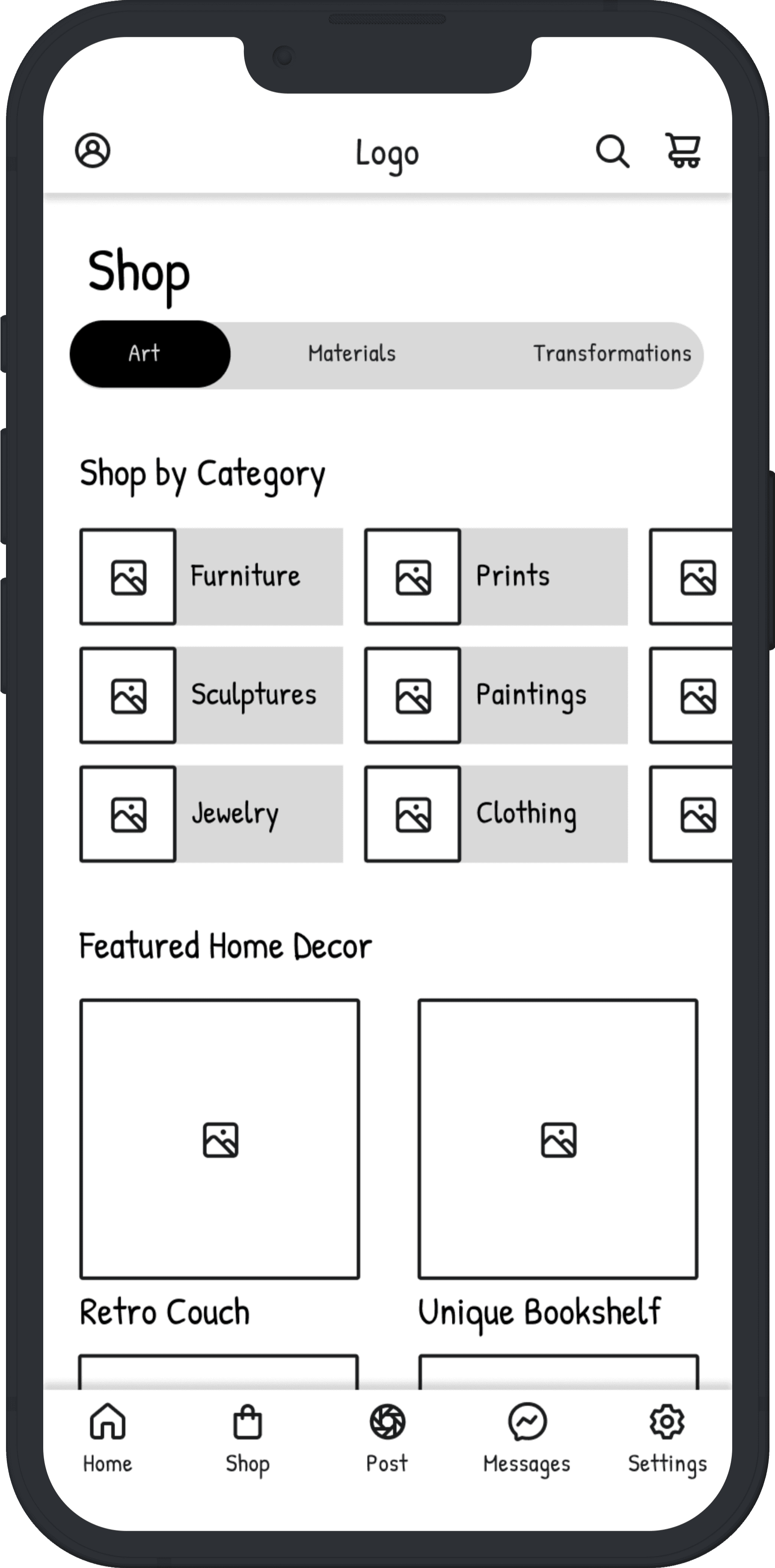
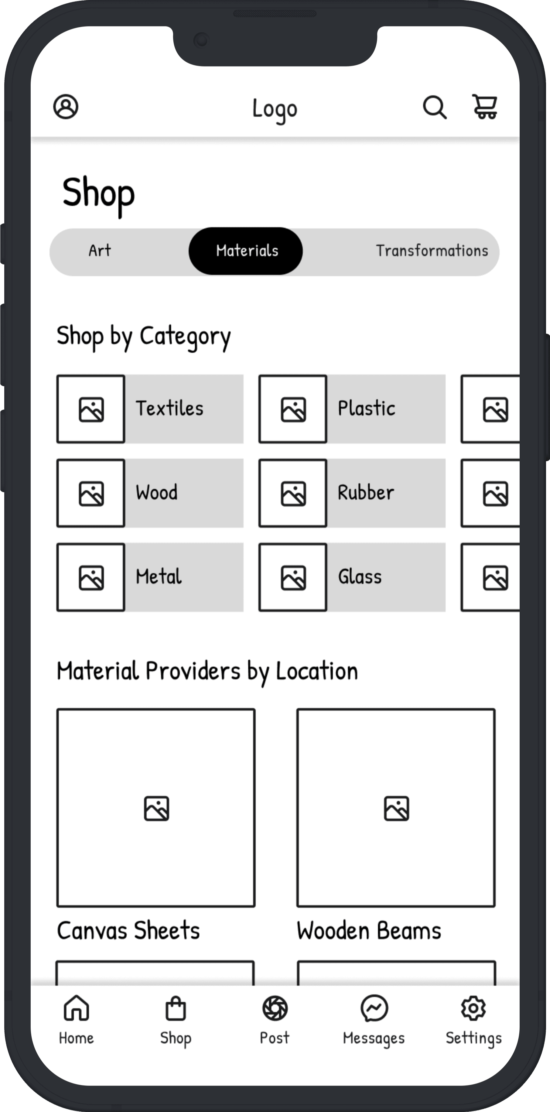
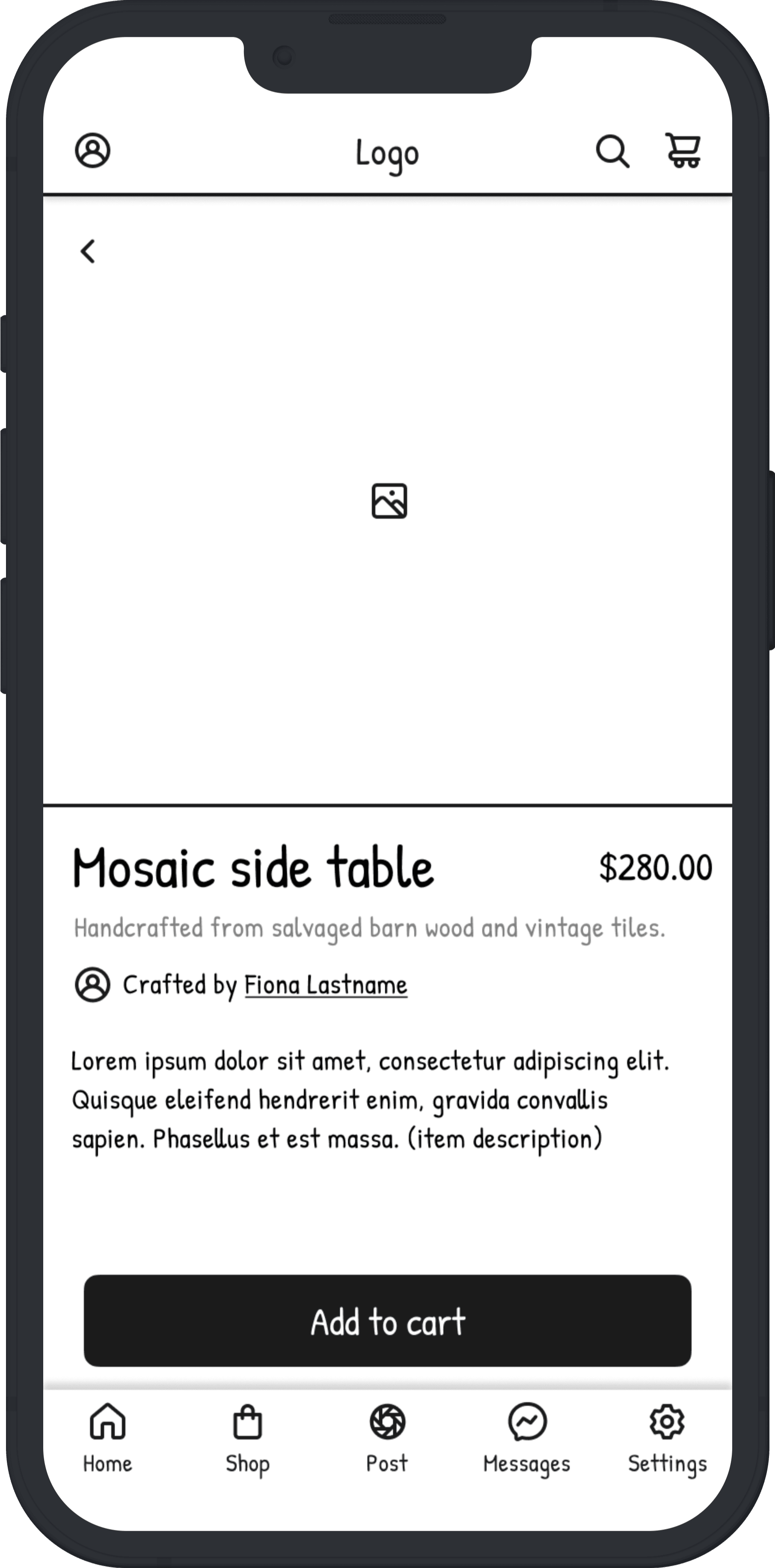
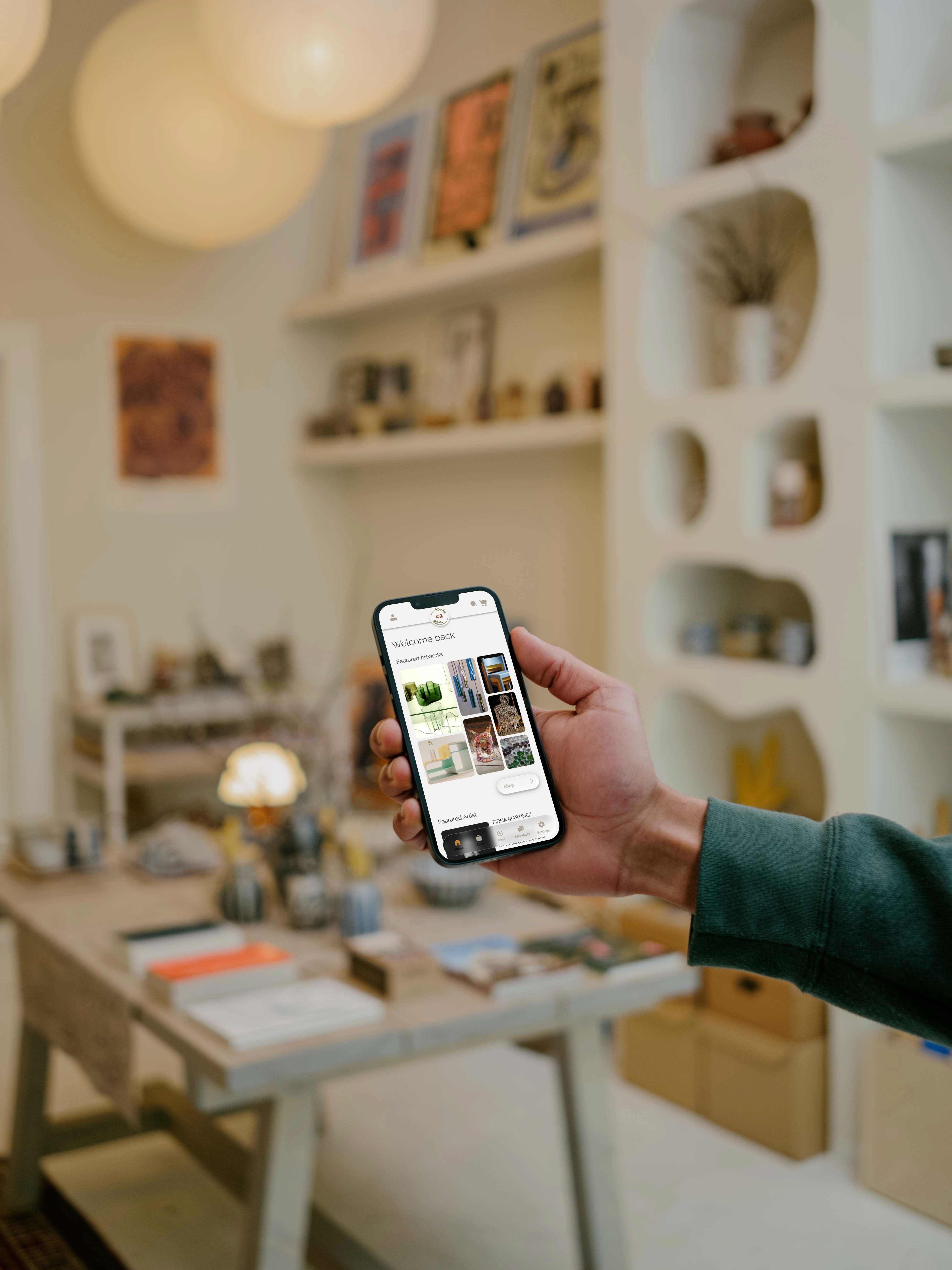
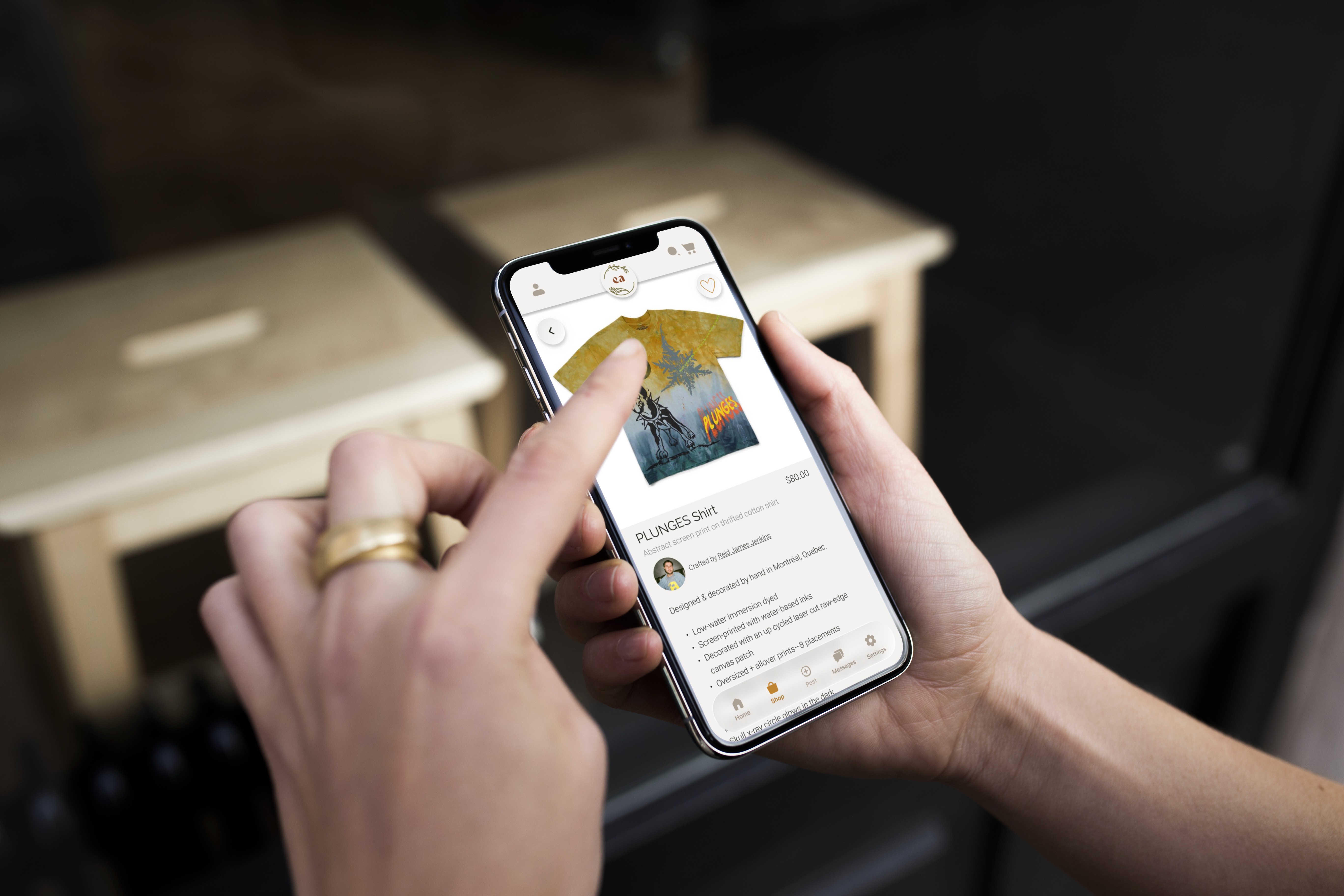
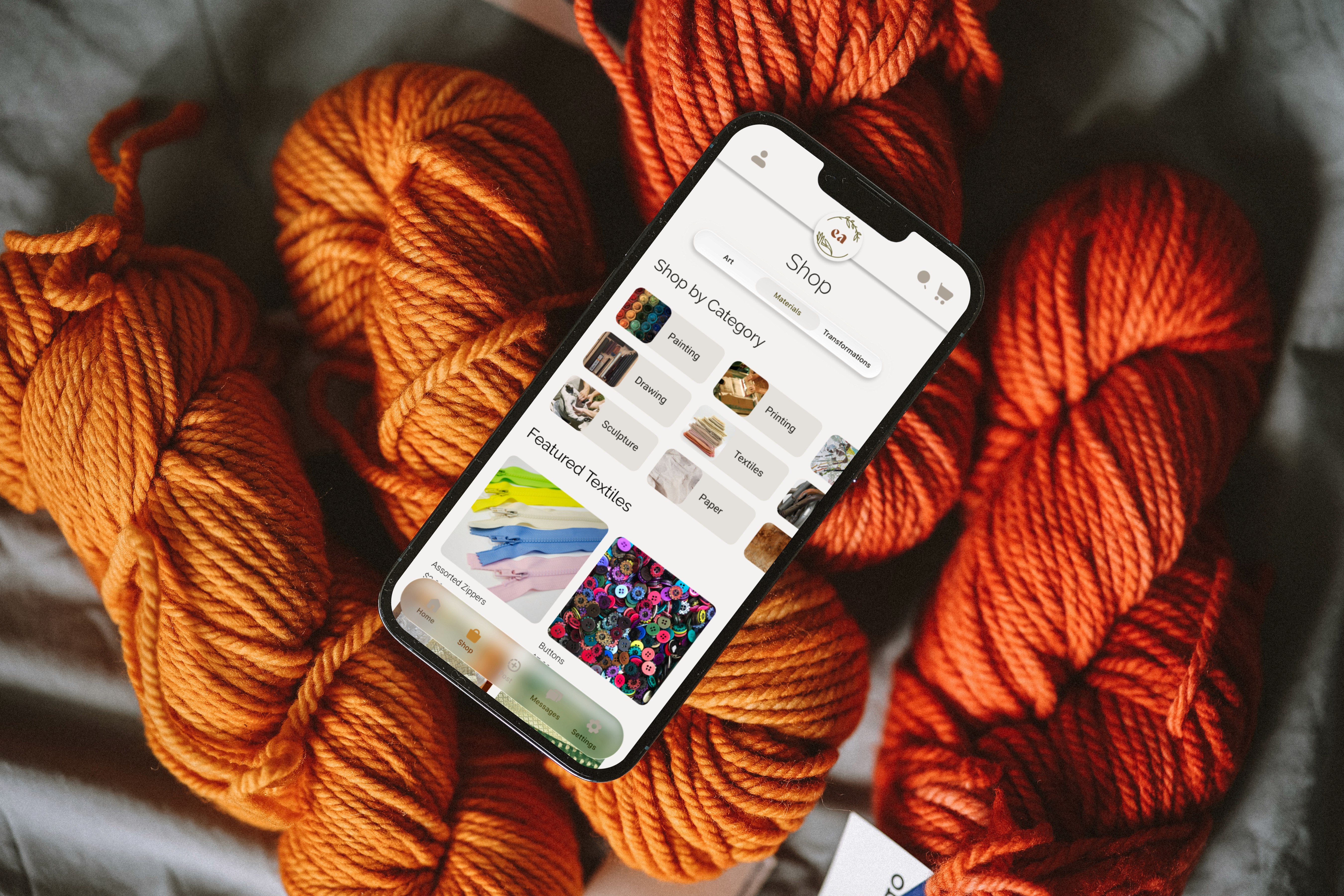
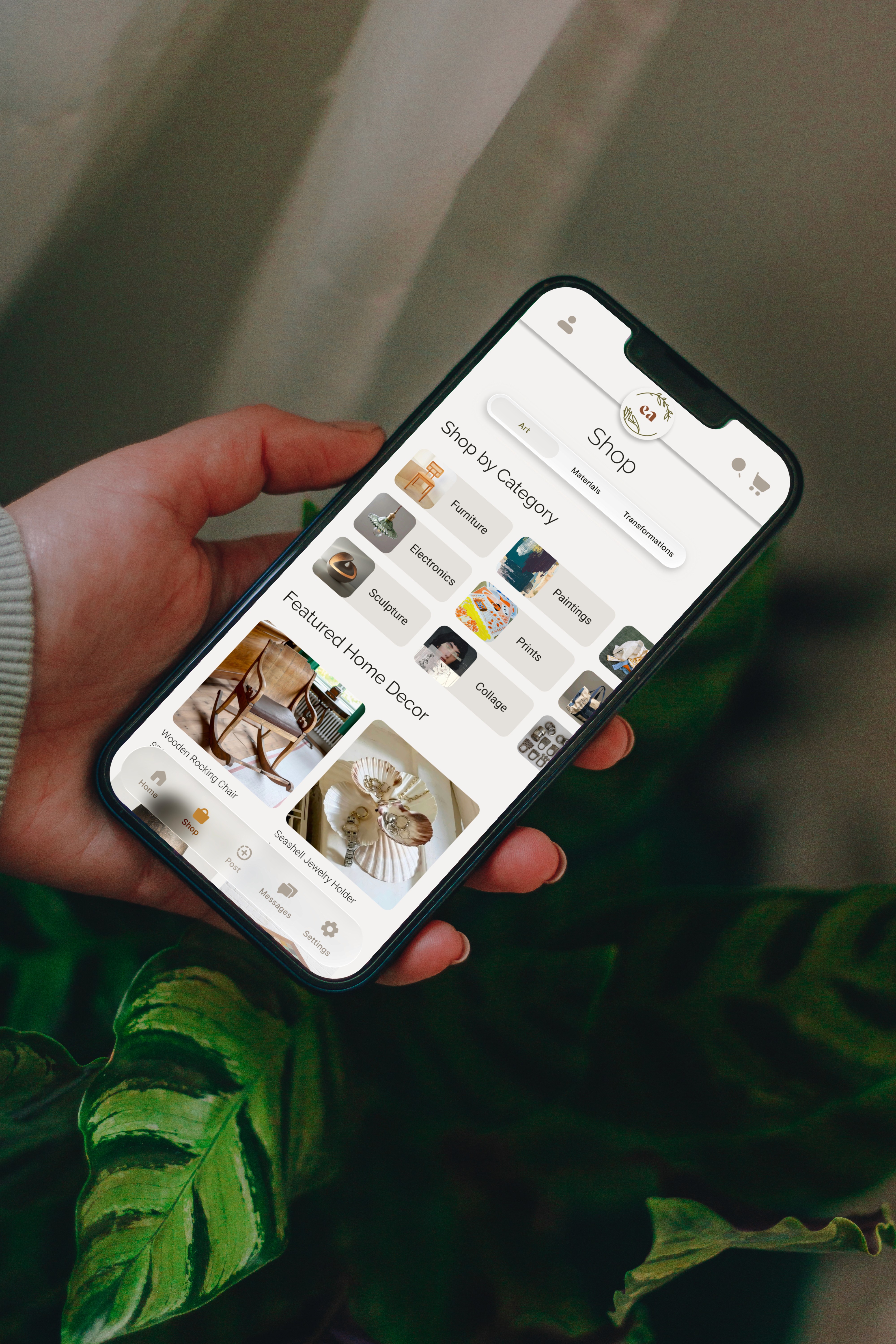
EcoArtisan is a platform designed to support Canadian artists by making sustainable materials more accessible, increasing exposure, and strengthening community connections across artists, buyers, and suppliers.

Showcase image
problem statement.

Artists lack income opportunities while reusable materials are wasted due to missing platforms that link creators with waste sources.

opportunity.

This gap presented an opportunity to design a single platform that simplifies sustainable material sourcing, increases artist visibility, and enables trust-based collaboration between artists, buyers, and suppliers. Success was defined as users being able to discover, list, and connect across roles with minimal friction during a single session.

How might we create a trusted, low-friction platform that allows artists, buyers, and suppliers to fluidly switch roles while supporting sustainable creation?

discovery.

Using a mixed-methods approach, research focused on identifying barriers to sustainable creation, understanding user needs across the ecosystem, and assessing market viability.

  • 9 semi-structured interviews

  • 16 survey responses

  • Competitor analysis

  • Secondary market research

Loading Chart...
Loading Chart...
Loading Chart...
Loading Chart...
key findngs.

01.

01.

High material costs and limited time push artists toward convenience over sustainability.

High material costs and limited time push artists toward convenience over sustainability.

02.

02.

Artists worry that reused materials may compromise quality.

Artists worry that reused materials may compromise quality.

03.

03.

Trust and collaboration are critical for adoption across artists, buyers, and suppliers.

Trust and collaboration are critical for adoption across artists, buyers, and suppliers.

personas.

My team and I designed three interconnected personas to reflect our ecosystem.

Fiona: The Artist
Primary goal: Create and sell sustainable work without increasing time spent sourcing or self-promoting.
Nick: The Buyer
Primary goal: To find, connect, and support verifed eco-artists within his community to build his art collection.
Nora: The Supplier
Primary goal: To efficiently redistribute unused materials from her small business while reducing environmental impact.
wireframing & prototyping.

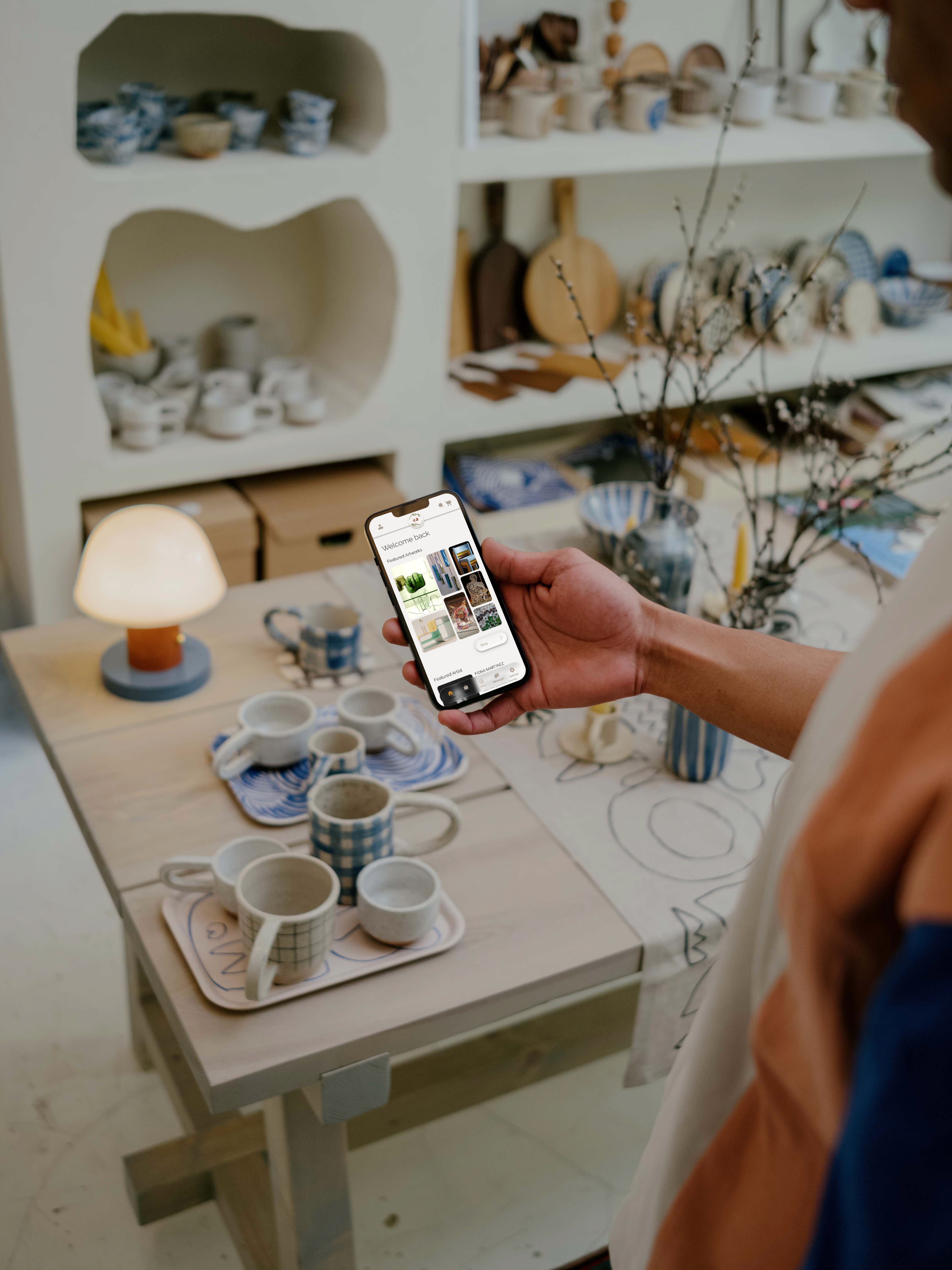
Early exploration considered separate interfaces for artists and buyers. This approach was rejected due to increased complexity and onboarding friction. A unified interface was chosen to support fluid role-switching and reduce cognitive load. All users can browse, post, and sell from the same space.

Showcase image
Showcase image
Showcase image
final design.

The final design balances functionality with a warm, handcrafted aesthetic to reflect the values of sustainability, trust, and creative community. A natural color palette of olive, terracotta, and amber was chosen to evoke organic materials and reduce the sense of transactional coldness often found in marketplaces. Raleway and Roboto support clarity and readability while maintaining an approachable tone. Subtle glass-like surfaces and neutral layouts allow artwork and materials to remain the focal point, reinforcing the platform’s role as a facilitator rather than a distraction.

The final design balances functionality with a warm, handcrafted aesthetic to reflect the values of sustainability, trust, and creative community. A natural color palette of olive, terracotta, and amber was chosen to evoke organic materials and reduce the sense of transactional coldness often found in marketplaces. Raleway and Roboto support clarity and readability while maintaining an approachable tone. Subtle glass-like surfaces and neutral layouts allow artwork and materials to remain the focal point, reinforcing the platform’s role as a facilitator rather than a distraction.


Key design decisions were informed directly by research insights:


  • A unified marketplace toggle allows users to seamlessly switch between Art, Materials, and Jobs, reducing friction for users who occupy multiple roles.


  • Verified profiles and community reviews build trust and address concerns around authenticity and sustainability claims.


  • Integrated messaging and featured artist sections support collaboration and visibility, responding to artists’ needs for exposure without added self-promotion effort.


  • The unified marketplace toggle directly addresses research findings around time constraints and multi-role users, reducing the need for separate workflows.

Showcase image
reflection & moving forward

Through multiple rounds of usability testing in Figma, we evaluated the clarity, flow, and overall usability of the EcoArtisan platform. Testers responded positively to the clean, trustworthy interface. Feedback also revealed areas for refinement, particularly around low-contrast elements on darker images, word-heavy menu options, and moments where the visual hierarchy needed clearer structure. Accessibility considerations included maintaining readable type scales and identifying low-contrast areas during usability testing for further refinement.

Overall, testing confirmed that users perceived the platform as intuitive, reliable, and visually appealing, with most completing key tasks with minimal friction. With more time, I would further test role-switching behaviours and refine accessibility across varied image backgrounds to ensure consistent readability.

Showcase image